

the Soviet avant garde
CONTEMPORARY DESIGNERS ARE often unaware of constructivism and its impact on contemporary graphic design, probably due to Josef Stalin’s efficiency in eliminating all evidence of it in the Soviet Union.
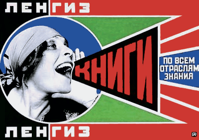

One of its objectives was to combine words and images as a simultaneous experience on the printed page and in film. At the time, beginning in 1919, this was a radical approach. The school of artistic and architectural philosophy was in favour of using art for social purposes, and for the use of whatever material was available for utilitarian solutions to communication problems. In spite of the Iron Curtain, somehow Europe absorbed its ideas by osmosis.
Constructivism, and especially Lissitzky, juxtaposed words and pictures in a way that would give rise to photojournalism. Photomontage, photograms and superimposition – so familiar today in the movie poster – also potentiated the printed page.
cubism, futurism, dada, surrealism, De Stijl,
art deco
Before saying much more about him, some preliminaries: cubism, futurism, dada and surrealism were stepping stones between art nouveau and Lissitzky’s legacy.

Cubism did not, however, owe anything to art nouveau other than a tip of the hat to Cézanne and the post-impressionists: it was a force of its own. Picasso and Braque dumped the illusion of three dimensions and brought design to the foreground. They stuck printed fragments on their paintings. They used printed and stencilled type which influenced typography.
Two other painters of the cubist period should be mentioned: Piet Mondrian, who later was a principal member of the De Stijl group of painters (see “De Stijl: Mondrian, Oud and Van Doesburg”), and Kasimir Malevich. Cubism’s influence penetrated commercial art directly in the 1920s.

Futurism and dada appeared in the years before World War I in Italy. Futurism took inspiration from Marcel Duchamp whose picture Nude Descending a Staircase used a kind of frame-by-frame view of action in overlapping images. Among that group was the architect Sant’ Elia whose designs were harbingers of the art deco style (seen in the posters at left and below).
But dada morphed into surrealism; it was anarchistic, nihilistic, shocking, absurdist, anti-art. Contributors included the photographer Man Ray and the painter Max Ernst. By 1922 it was all over but surfaced again in Andy Warhol’s work in the 1960s and ’70s (see “Pop Art: Roy Lichtenstein and Andy Warhol”).

As so often happens in art history, war interrupted the flow of inspiration, but their ideas on Machine Age aesthetics survived in De Stijl and the Bauhaus after World War II, and became important elements in art deco, hence its significance to graphic design because it freed typography from the rectilinear box and made letterforms an element of visual experience, breaking the mould.
Afterwards, it would be up to the Bauhaus to bring order to the chaos without losing the freedom that dada sought. Another post will feature the contribution of the Bauhaus designers to contemporary graphic design (see “The Bauhaus and The International Style”).
Surrealism also deserves a post of its own, but suffice it to say for now that because it was informed largely by Sigmund Freud’s ideas about the unconscious mind and its expression in dream imagery, hidden motivation and emotional response, it had an especially strong influence on visual communication, particularly illustration, in advertising.
El brings it on

The influential Russian studied with Marc Chagall, worked with Malevich, and hung out with the De Stijl and Bauhaus designers in Europe. A visionary, he broke the confines of convention in typography and emphasized continuity of design rather than individual pages, ideas that later developed into design grid systems. Print media and websites are rarely constructed without them. Fifty years ahead, he foresaw the use of photography in graphic design and how photomechanical methods would free designers from dependence on lead type and the metal engravings of traditional printing technology.
~ Robert Grey

postscript
At left is a twenty-first-century homage to constructivism, in particular Rodchenko, an album cover for Scottish indie rock band Franz Ferdinand.